HOWDY BEER Packaging
Package Refresh
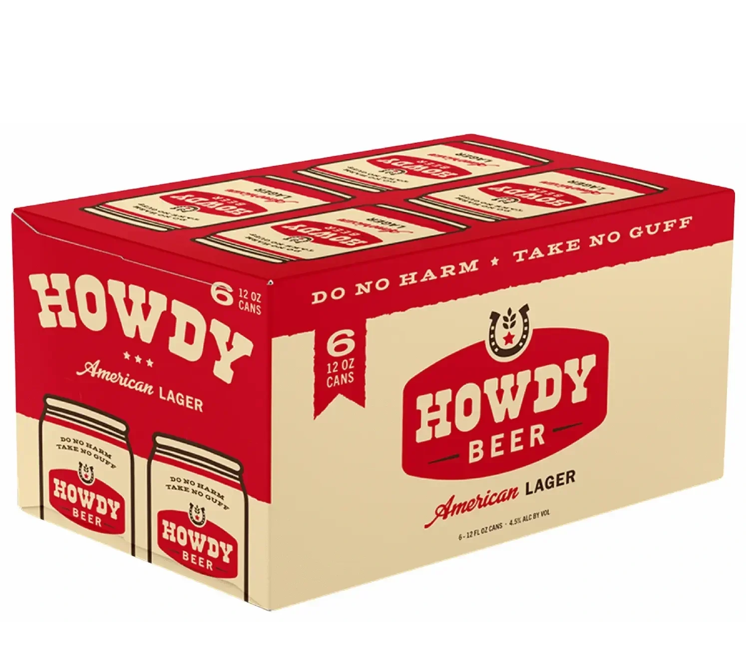
Original Box

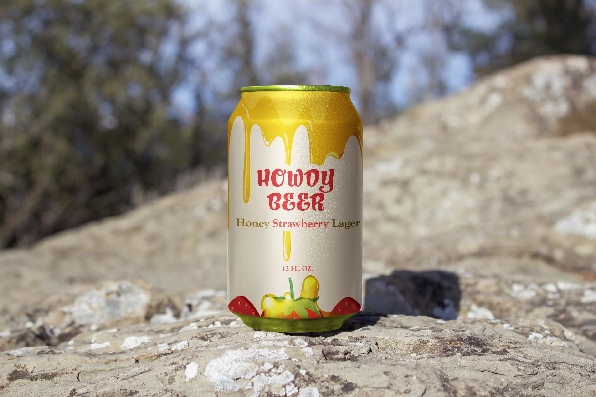
Redesigned (cottagecore) Box
Overview
This project reimagined Howdy Beer’s packaging by shifting its visual identity from a Western cowboy aesthetic to one that resonates with cottagecore Millennials. The goal was to redesign the packaging to reflect values of comfort, nature, and slow living.
Role
I conducted audience research, explored cottagecore visual trends, and created all design assets for the refresh. This included deconstructing the original box, redesigning and reconstructing it, and extending the system to include can and bottle designs.
Process
The new identity drew inspiration from honey and strawberries, using warm tans and yellows as the primary palette. A dripping honey motif flows over strawberry illustrations, blending rustic charm with natural sweetness to evoke a handcrafted, nostalgic feel. The design assets and layouts were developed with a focus on appealing to Millennial consumers seeking authenticity and a stronger connection to nature. By constructing the box physically and creating can and bottle variations, the rebrand extended across multiple formats, presenting a cohesive and immersive identity.
Outcome
The rebrand successfully transformed Howdy Beer into a product line that aligns with cottagecore aesthetics and consumer values. The final packaging communicates a sense of comfort and authenticity, positioning Howdy Beer to resonate with a new audience while distinguishing it from its original cowboy-inspired brand identity.